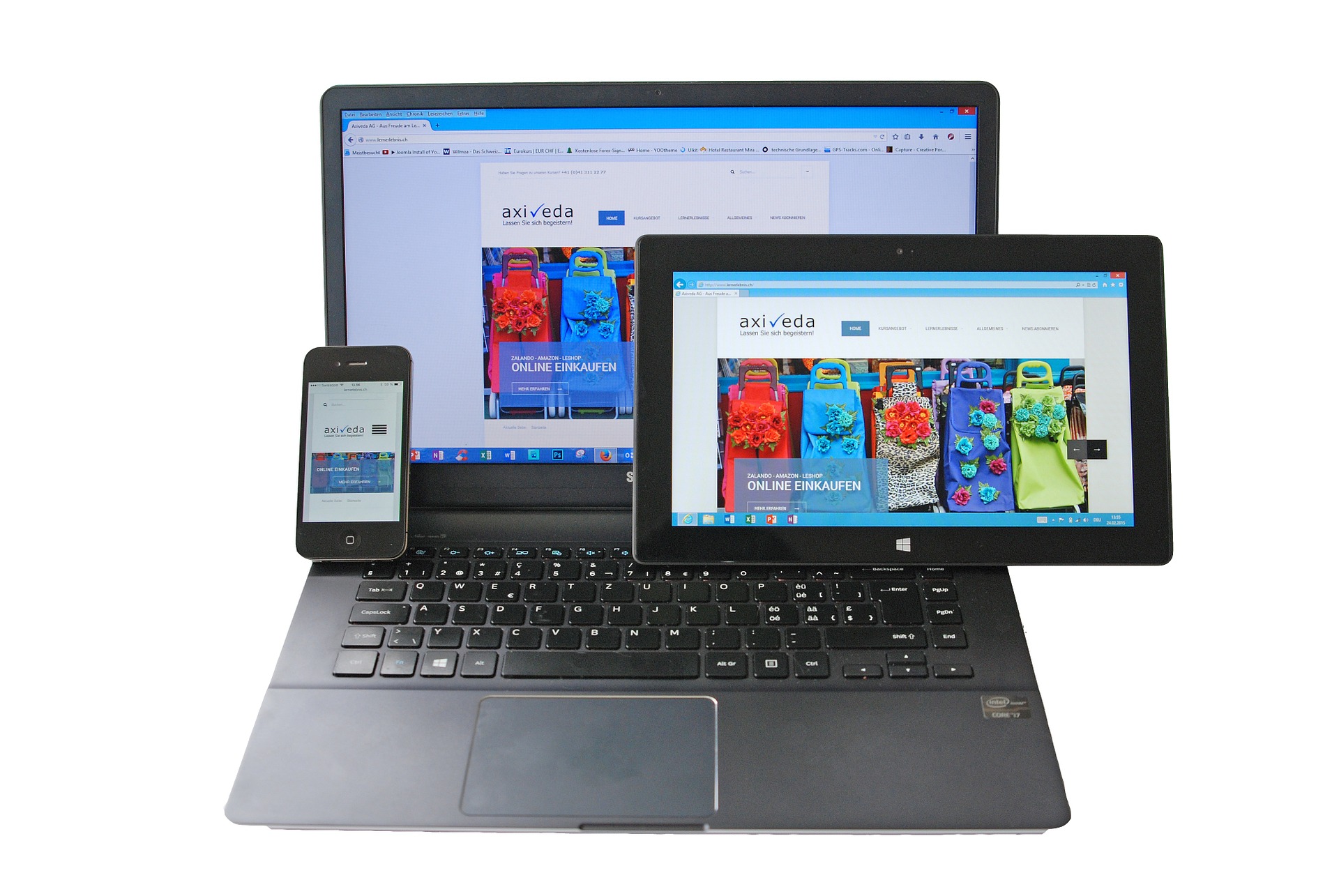
It used to be that the only way that websites were accessed was from a desktop computer. Then, everything started shifting towards laptops because they were portable. Now, just about everyone has a mobile phone with web surfing capabilities. So, has your website been able to keep up? If not, here are some reasons why it is important to implement responsive website design.
What Is Responsive Design?
Have you ever accessed a website via your smartphone and had to learn acrobatics just to see the page? Maybe you turned it sideways to see the text in one screen or kept resizing with your fingers to see all the detail. You might even have had to scroll continuously from left to right just or read one sentence. It’s frustrating to be sure.
What responsive design does is code each webpage so that it automatically adjusts to the medium you are using to view it. Whether a tablet, large smartphone, small smartphone, laptop or a stationary desktop computer, each person will see the page in an optimized fashion for their device. Sounds great, doesn’t it. So, why isn’t everyone using it right now?
Five Reasons to Implement Responsive Design
Updating your website with responsive design tools right now will have several positive effects.
Higher conversion rates – People are not stationary and neither are their devices. Someone who wants to check out a product on your website to compare a price with something they see in the store wants an immediate response. A mobile-ready site allows them to click a few buttons and order the lower-cost product you offer instead of paying more in the store.
Improved user experience – Responsive design says to a user that you are catering to their needs. For someone who uses their mobile device 90 percent of the time, this is huge. They can make dinner reservations, set up service appointments, book a hotel and even buy a product, all from their phone using websites that have implemented responsive design. When users feel valued and have a great experience, they come back.
Less work for you – Using responsive design at the outset allows you to focus on the most important aspects of your site and deliver that to viewers on a smaller platform. From there, it is easier to add more content for larger devices.
Better search engine rankings – Make Google happy with responsive design web pages. It is the same website but optimized for viewing with different devices. This is easier for you and the search bots than utilizing a separate mobile site.
Flexibility – Your site can adjust to a number of devices for viewing. You can add different content to be seen on each device as added value. The content will expand to fill the space given on each device, with the main content and design remaining constant across all devices for a seamless experience.
Is your website still best used for larger computers? It may be time to make the move to responsive design.


